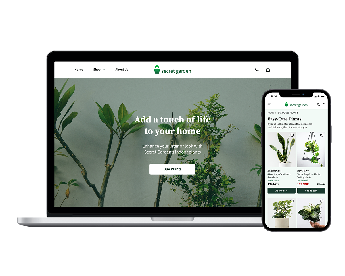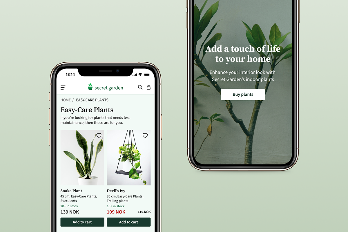
An online store that lets users buy indoor plants for their homes
The project requires building a responsive website, web app, or mobile app that helps everyone find products quickly and easily to match their particular needs. I chose an online store for buying indoor plants.
Finding a physical store to buy plants can be hard sometimes. They might have to travel far or not have the time to get there. And it is hard to know whether they have the plants they want or not.
Secret Garden lets users buy their desired indoor plants online and deliver them to their addresses. They can always check the plants’ availability, place orders, and pay in their preferred payment method.
I decided to work on these three user stories to help me determine what functionalities the online store should prioritise.
As a new customer, I want to access the inventory without having to register, so that I can make sure this store has what I’m looking for before having to create an account.
As a customer, I want to be able to place multiple items in a shopping cart, so that I can purchase more than one item at a time.
As a customer, I want there to be a variety of payment options, so that I can choose the payment method that suits me best.
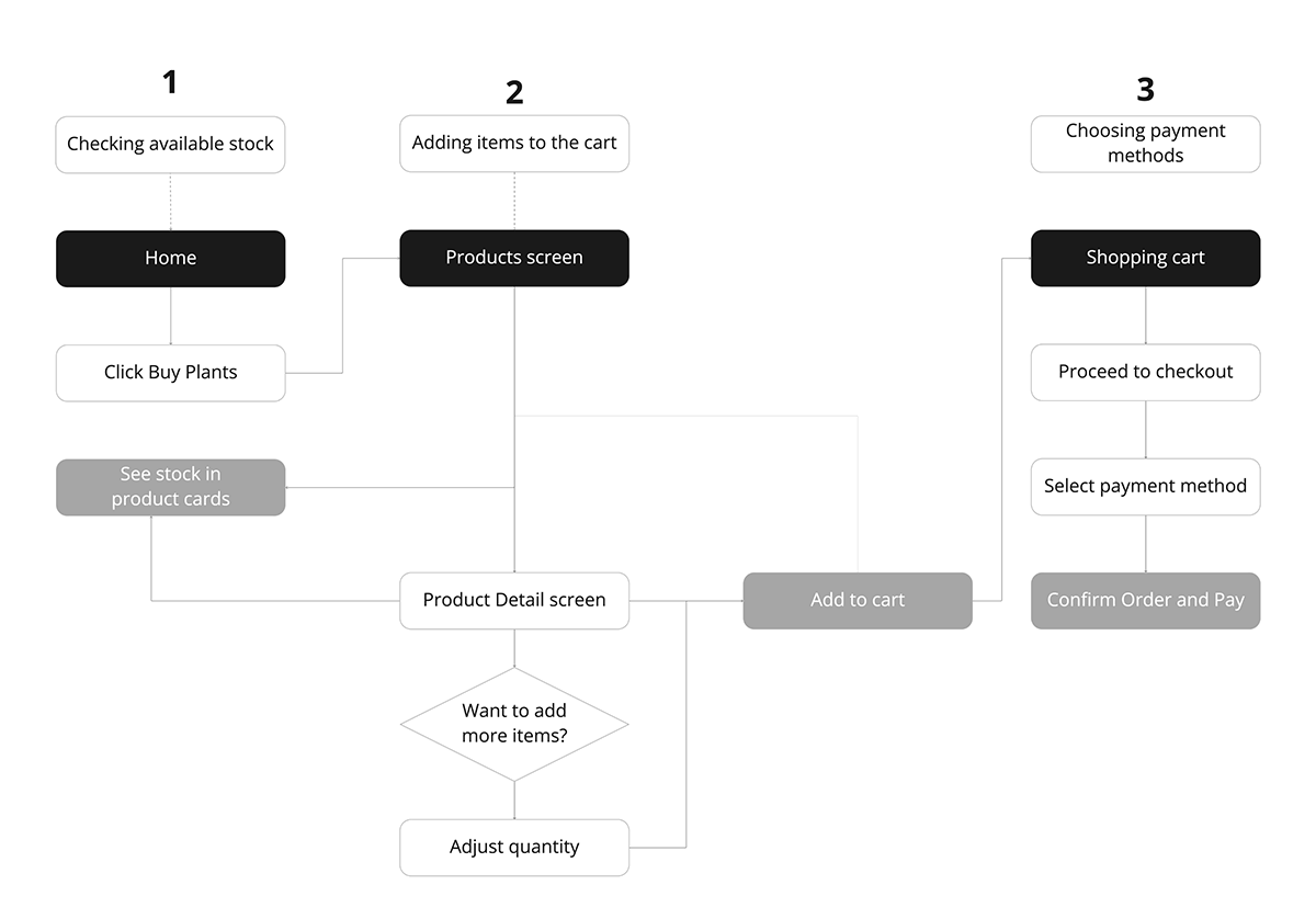
I created a user flow that shows the steps the user would take to reach their goals, from looking for available products to placing an order and paying.
Using the user flow and the user stories I then started sketching my initial designs.
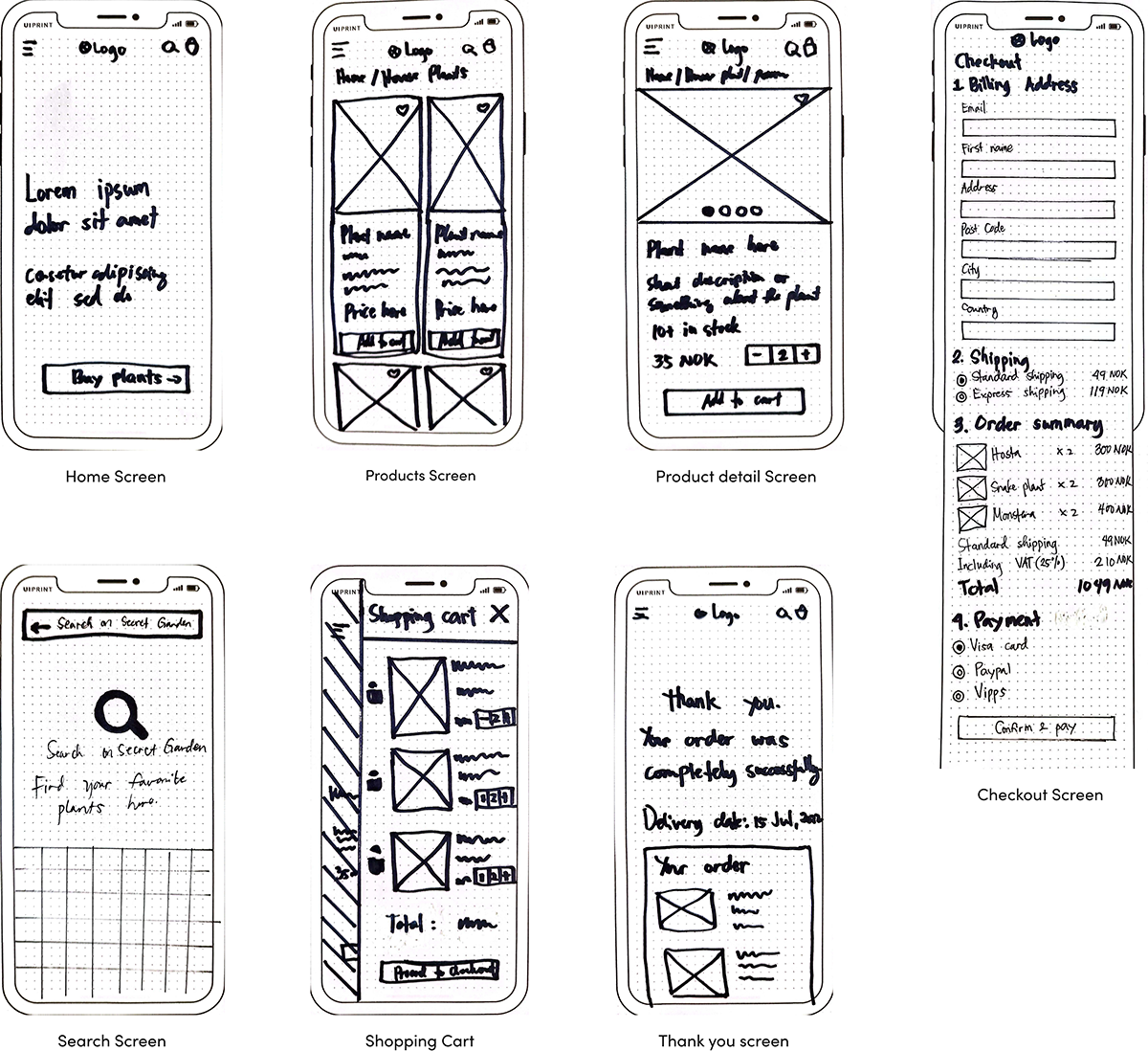
During this process, I refined the design on Adobe XD. I added more screens and carried out a prototype test later after that.
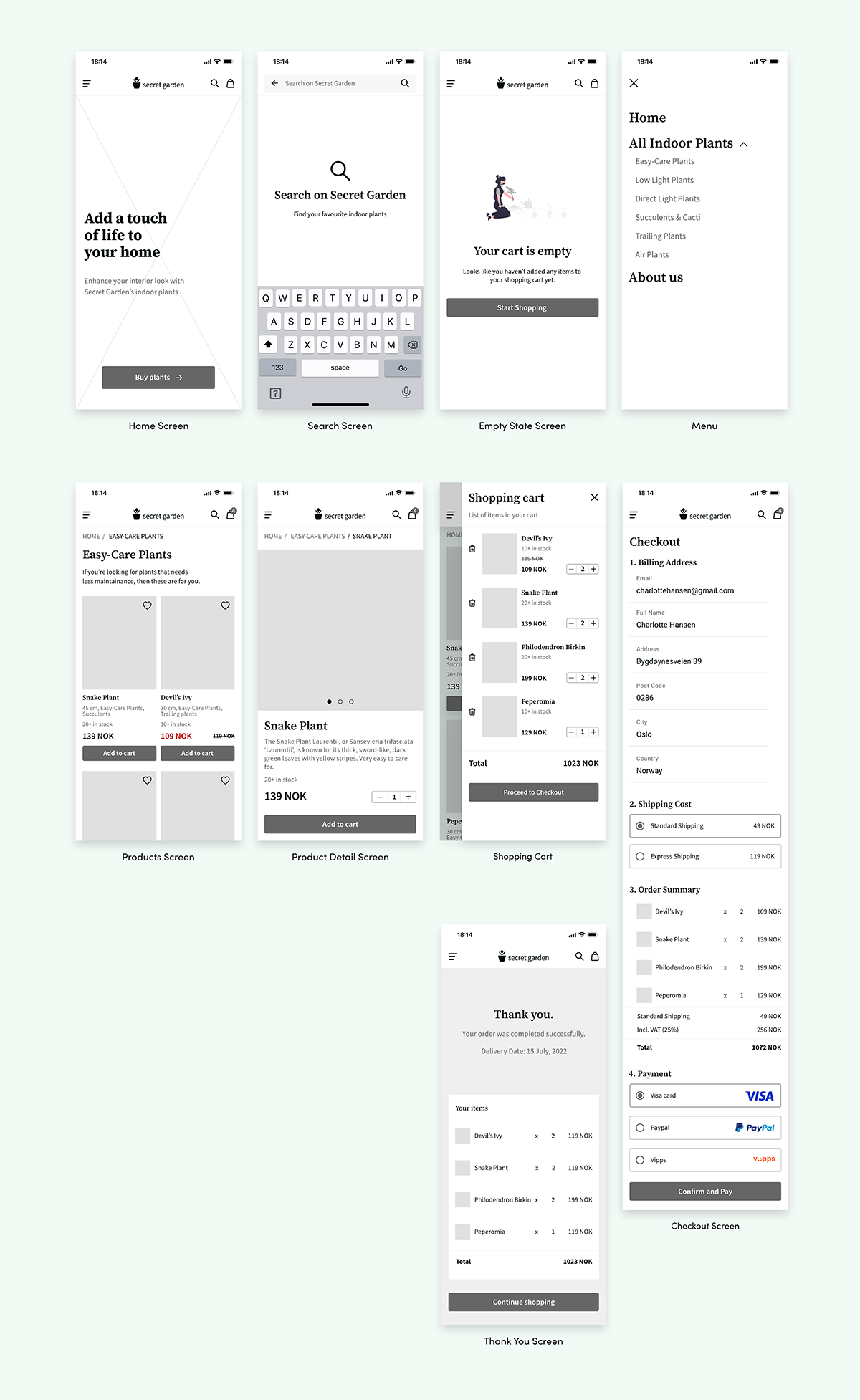
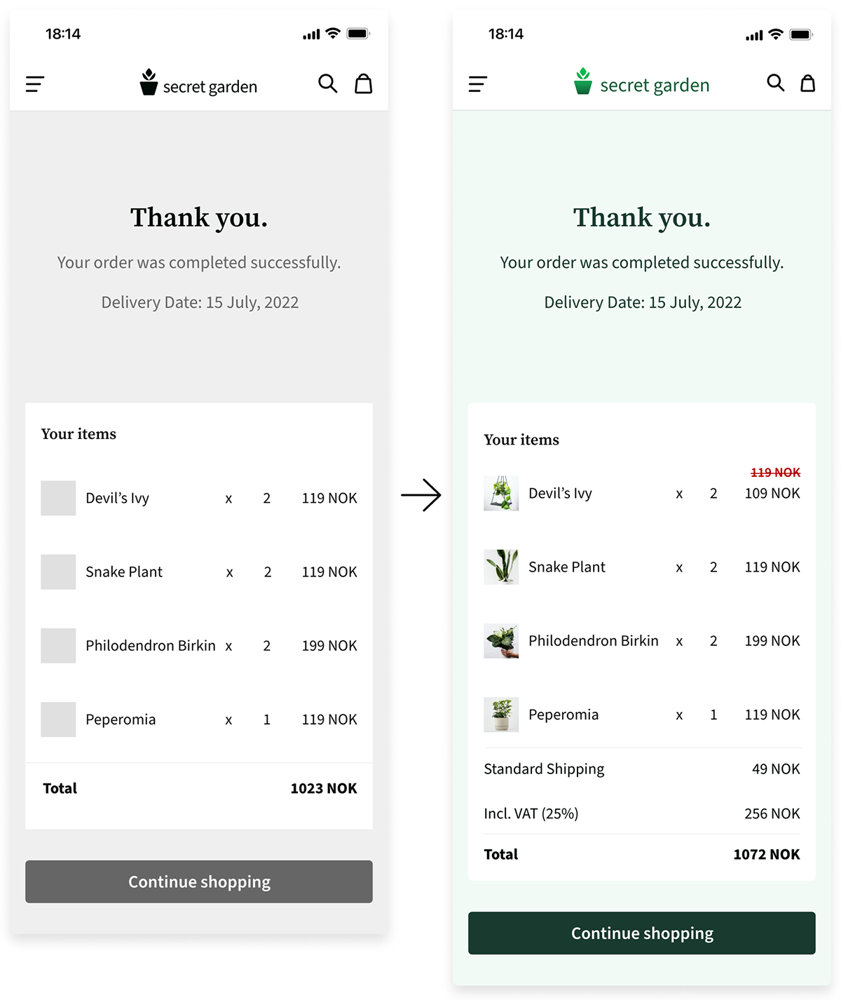
The feedback was quite positive, and users thought it was intuitive and easy to use. However, there were minor details missing and wireframe connection issues during the prototype.
Added the missing shipping and VAT information
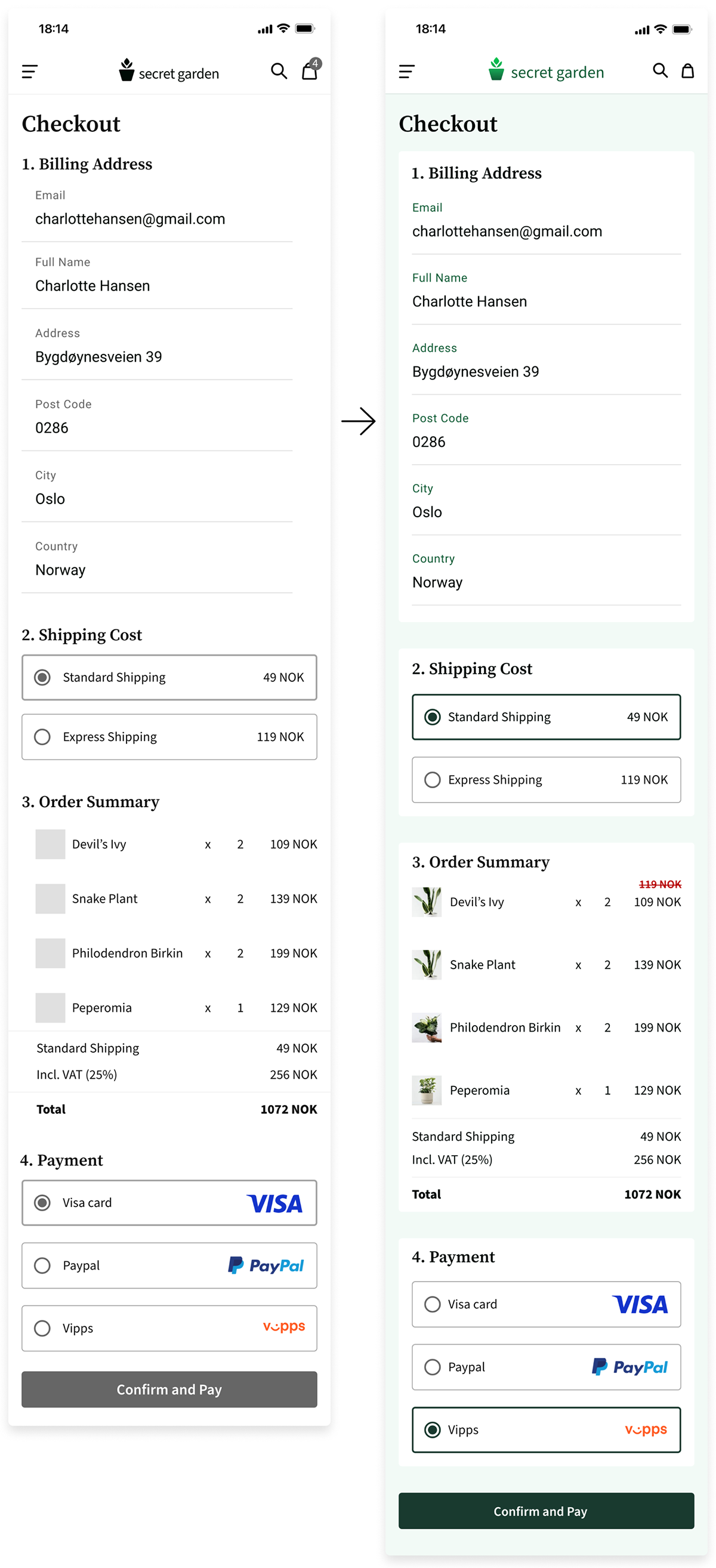
Slightly changed the styling on the checkout screen
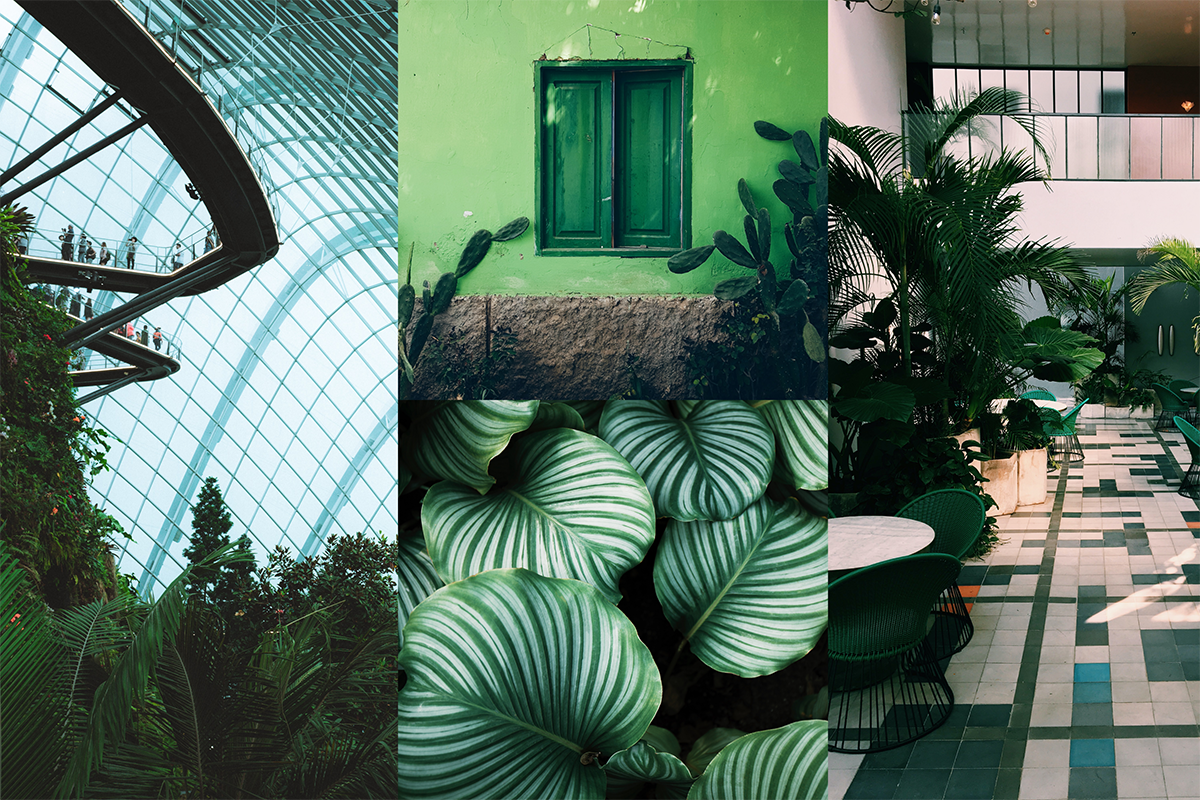
Secret Garden’s design uses the following guides to create a simple way of buying plants online. I aim for simplicity with a touch of modern look to it.
I wanted the logo design to be easy to understand, read and maintain. The logo will be in gradient colors when used on a white background.
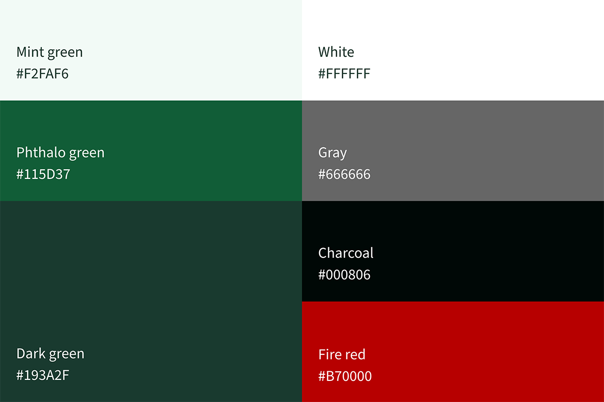
Dark green is the primary color of the app and a subtle tint of light green for the background. Gray and dark gray is used mainly for text.
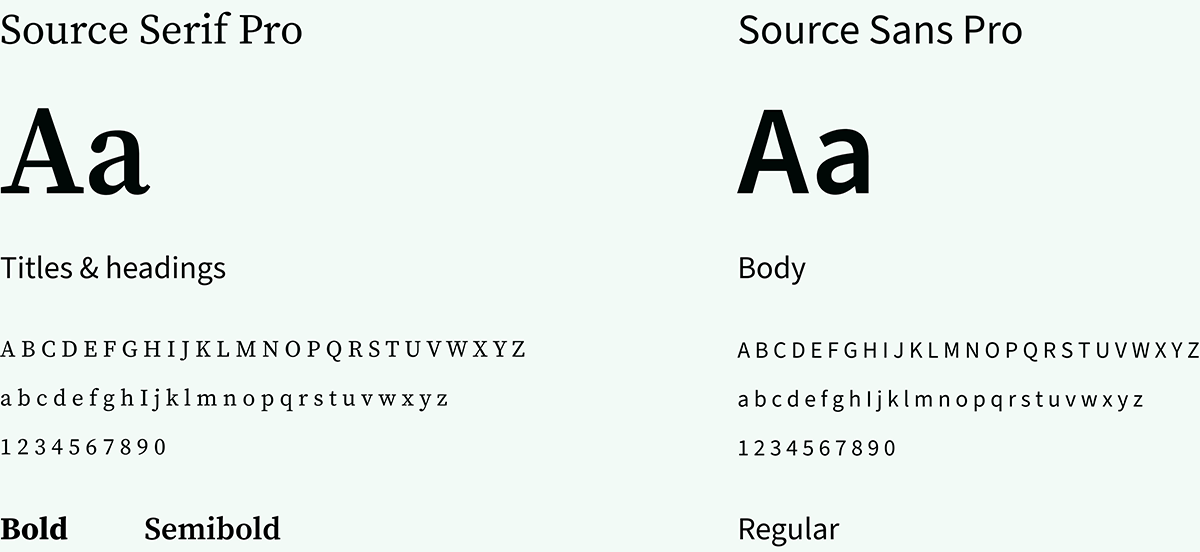
I chose Source Serif Pro for the titles and headings and Source Sans Pro for the body text. These fonts pair well which makes the app look more elegant.
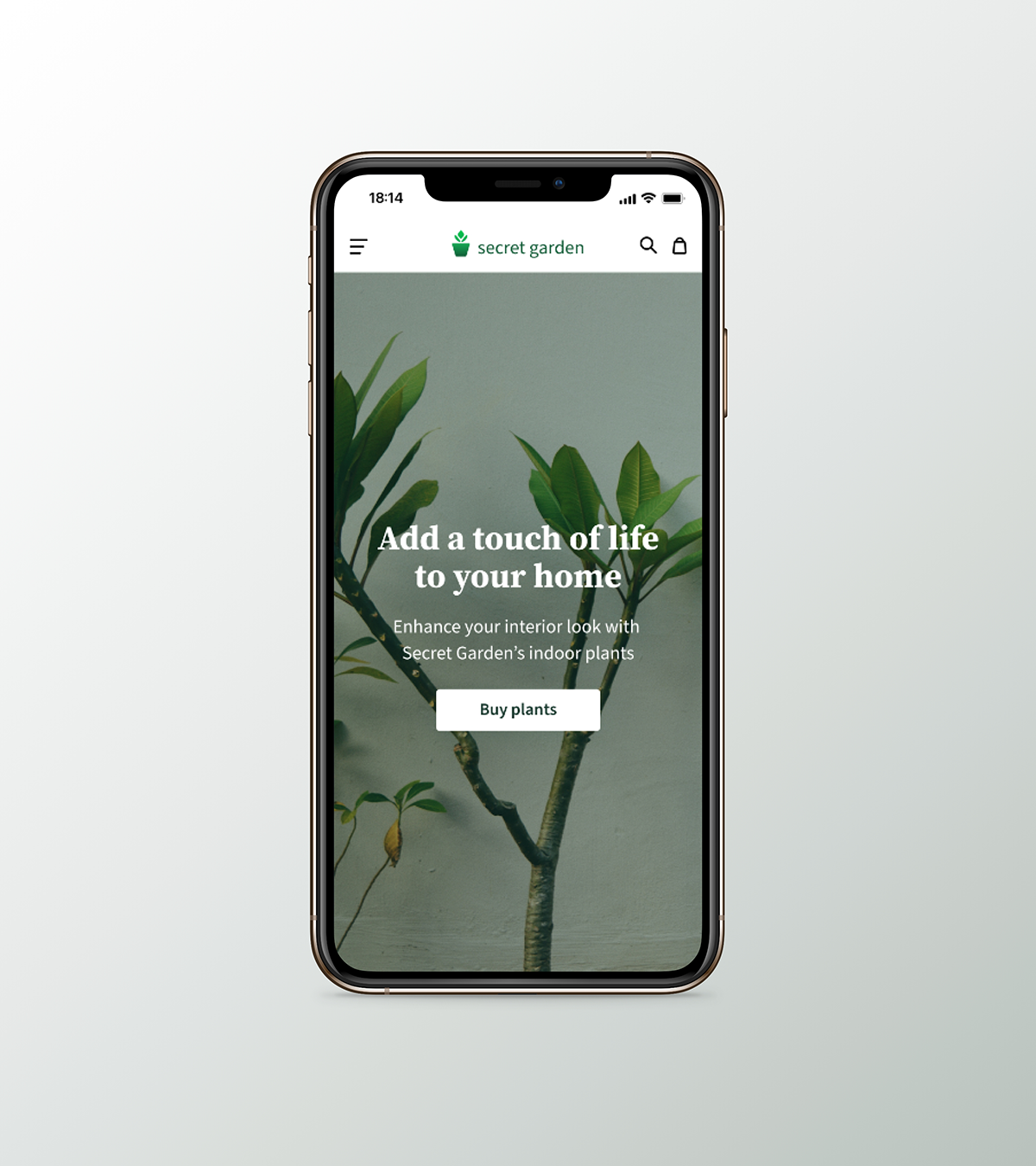
It has a simple landing page with a plant image background, a slogan, and a short introduction of what the store has for the customers.
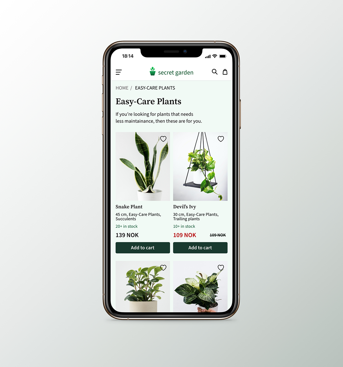
Products are organised into cards, making scanning each item’s information easier, including the stock number, its price and an action button.
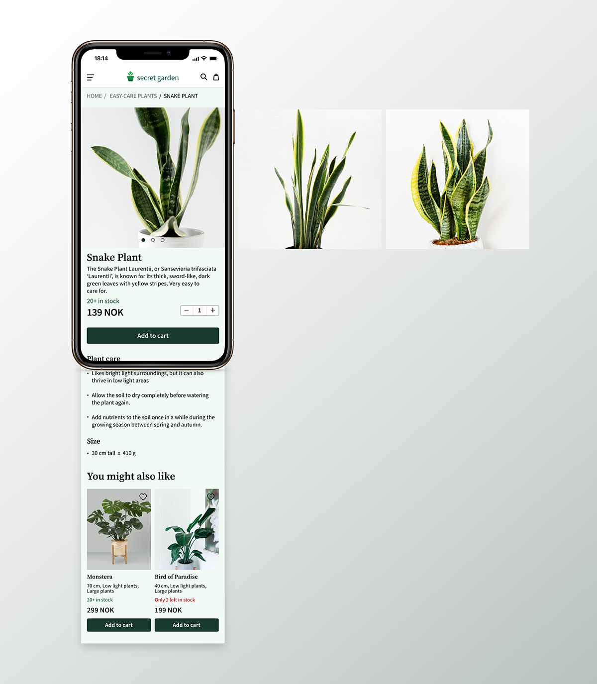
See all information about the plant before buying them. You can also adjust how many items you want to purchase and add them to the cart.
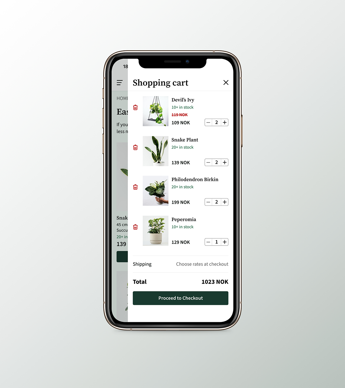
Quickly go back to shopping when viewing your cart. You can also adjust how many items you want to add, change, or remove. Stock availability is always visible to show that items are still available.
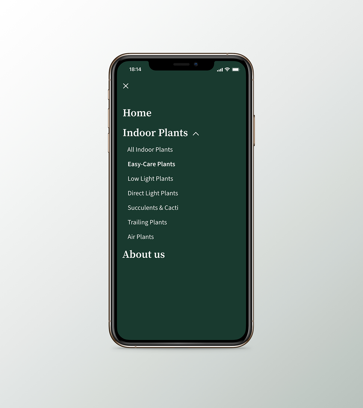
All indoor plants are organised into different categories to make it easier for users to look for other or specific types of plants.
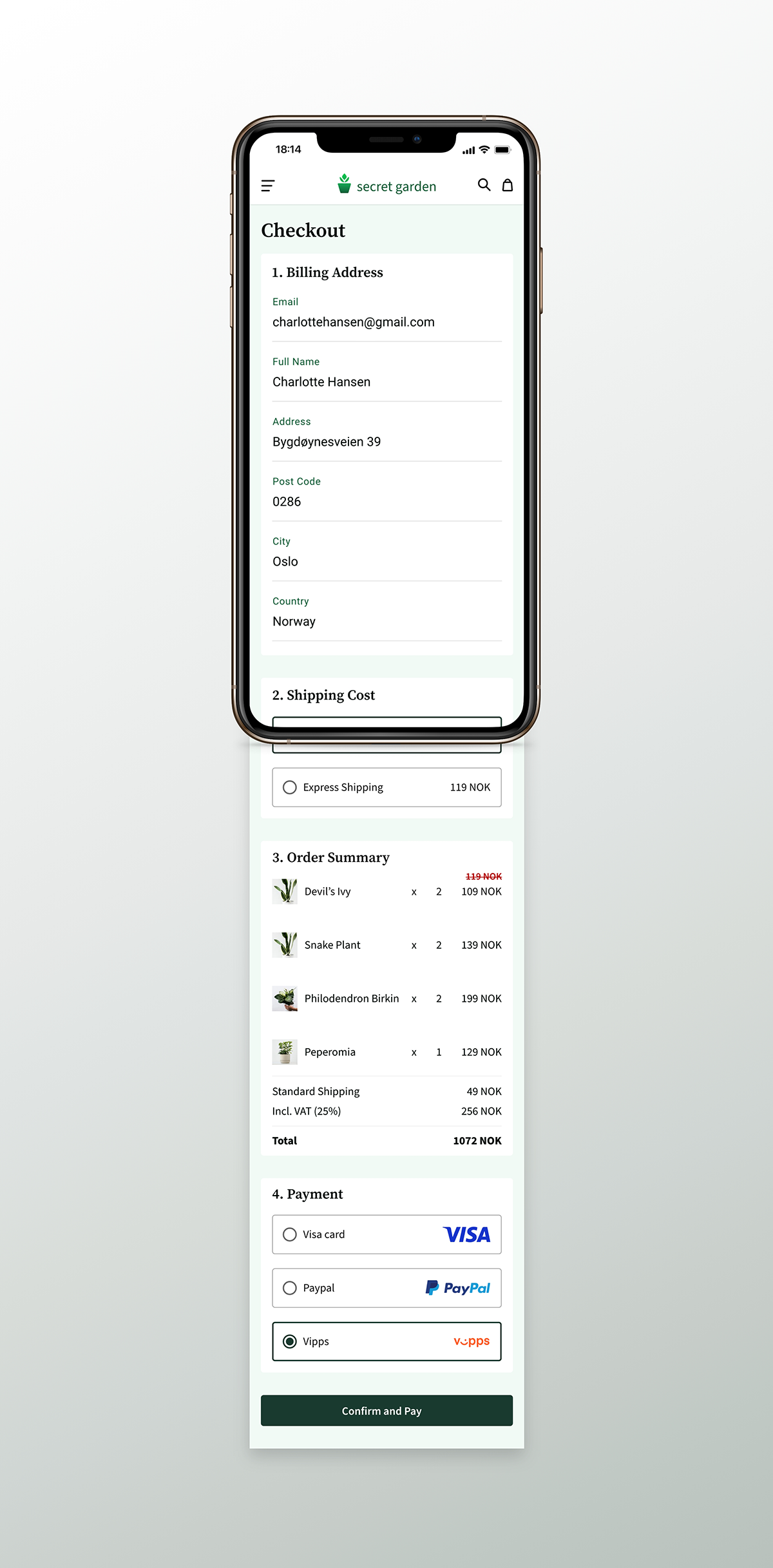
Placing an order is easy by just filling in the necessary details so your items can be delivered correctly. Then choose your shipping and pay at your preferred payment methods available.
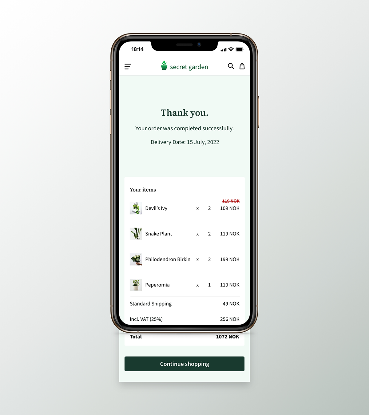
To provide positive feedback, I decided to include this to show appreciation to the user for choosing to shop at Secret Garden.
